02-06
work file/
ff autoworks
Time
4 weeks
My Role
Brand designer
Tools
Figma, Illustrator, Photoshop, In Design
Platform
Graphics, Merch
About the project
Form and Function Autoworks, an auto shop located in the heart of Richmond, approached me with the goal of establishing a strong, cohesive brand identity that would set them apart in a competitive market. They wanted a visual identity that embodied both precision and efficiency, core values that define their approach to automotive service.
The Challenge
The challenge was to create a brand that seamlessly blended "form" and "function"—a balance between aesthetics and practicality. The identity needed to be modern, clean, and professional while also conveying reliability, craftsmanship, and high-quality service. Beyond the logo, the branding had to extend across multiple touch-points, ensuring consistency in every aspect of the business’s customer interactions.
final
Logo Development
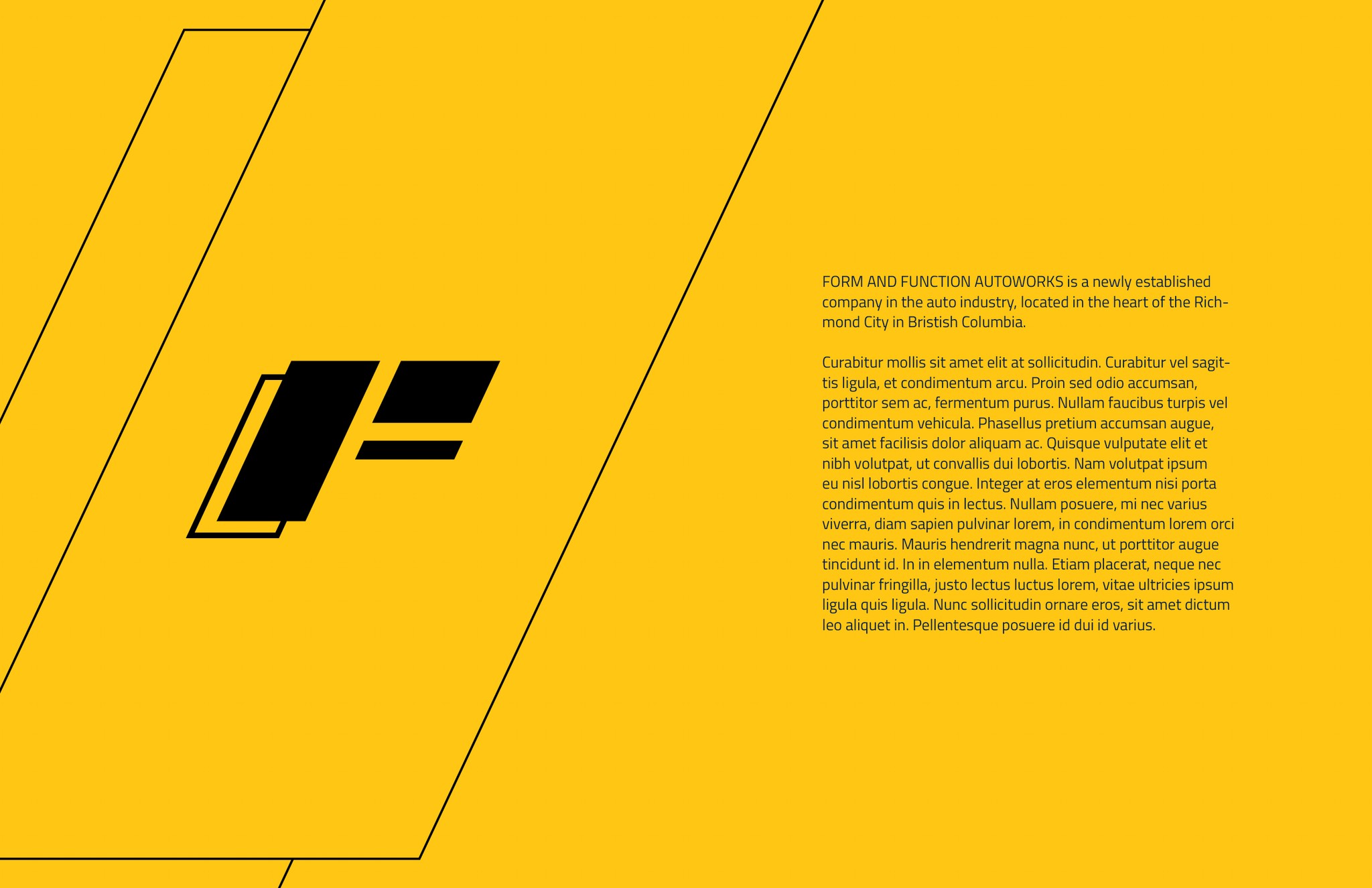
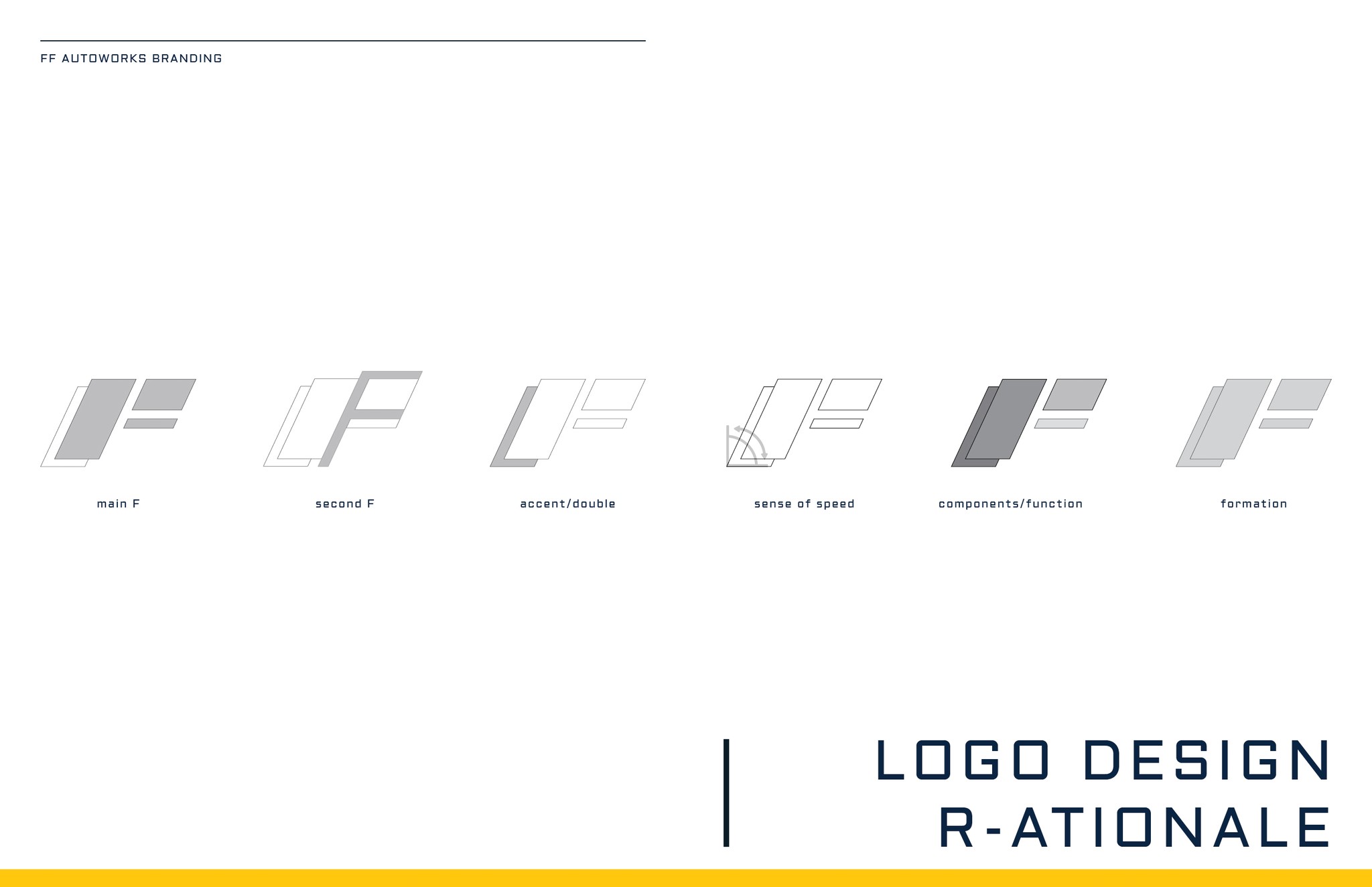
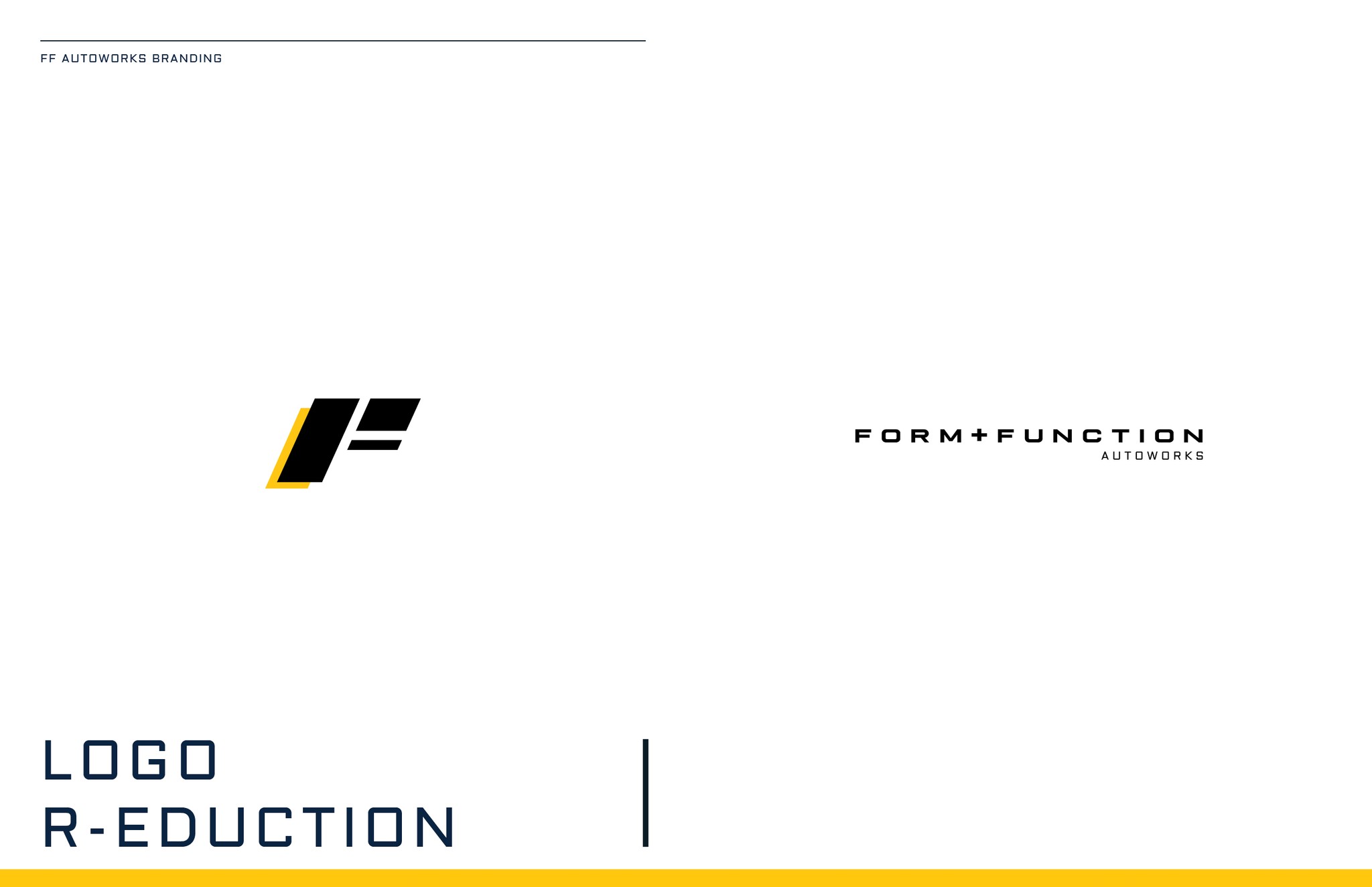
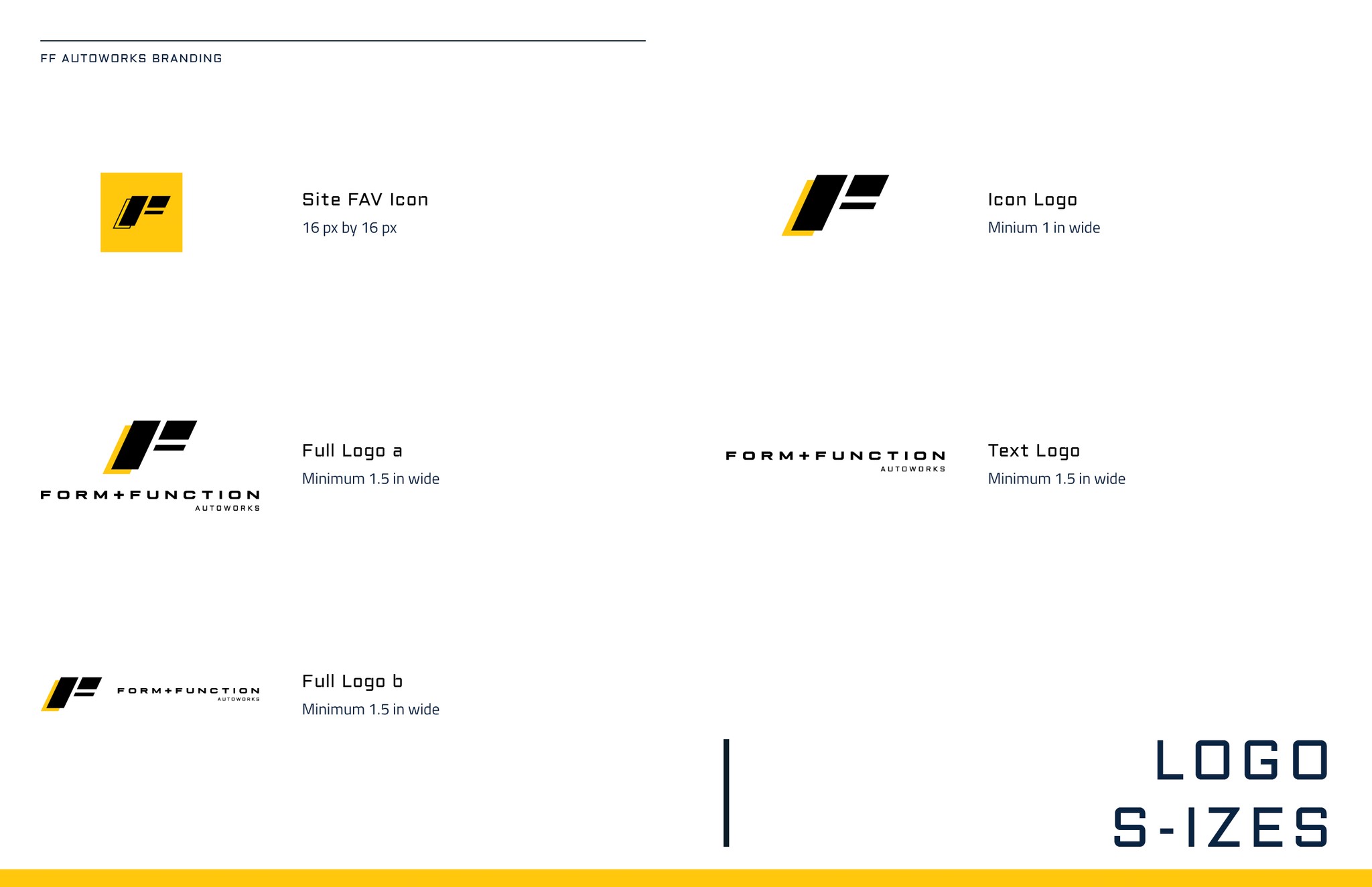
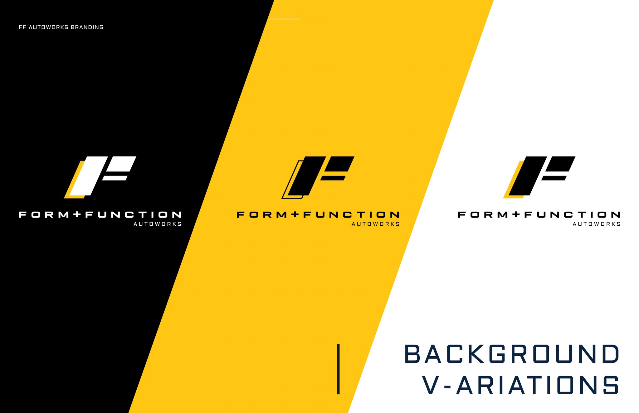
The branding process began with the creation of a distinctive logo that embodies the shop’s name and philosophy. I focused on the letter ‘F’ since both words start with it, using it as the foundation for the design. The logo blends sleek, modern aesthetics with a structured composition, reflecting a balance between form and function. The goal was to create a memorable and versatile mark—one that stands out while maintaining a clean, minimalistic design.
Color Palette & Typography
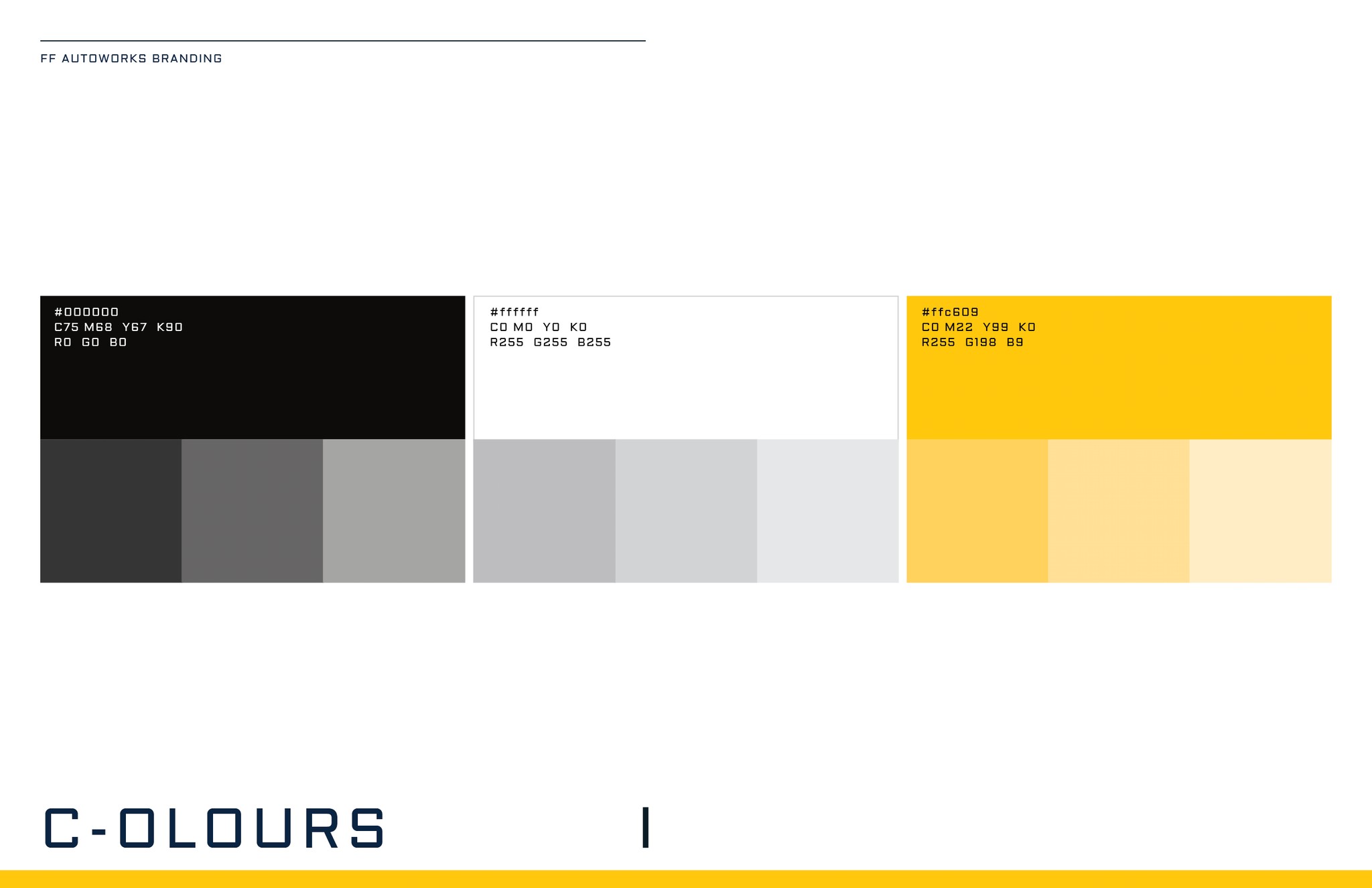
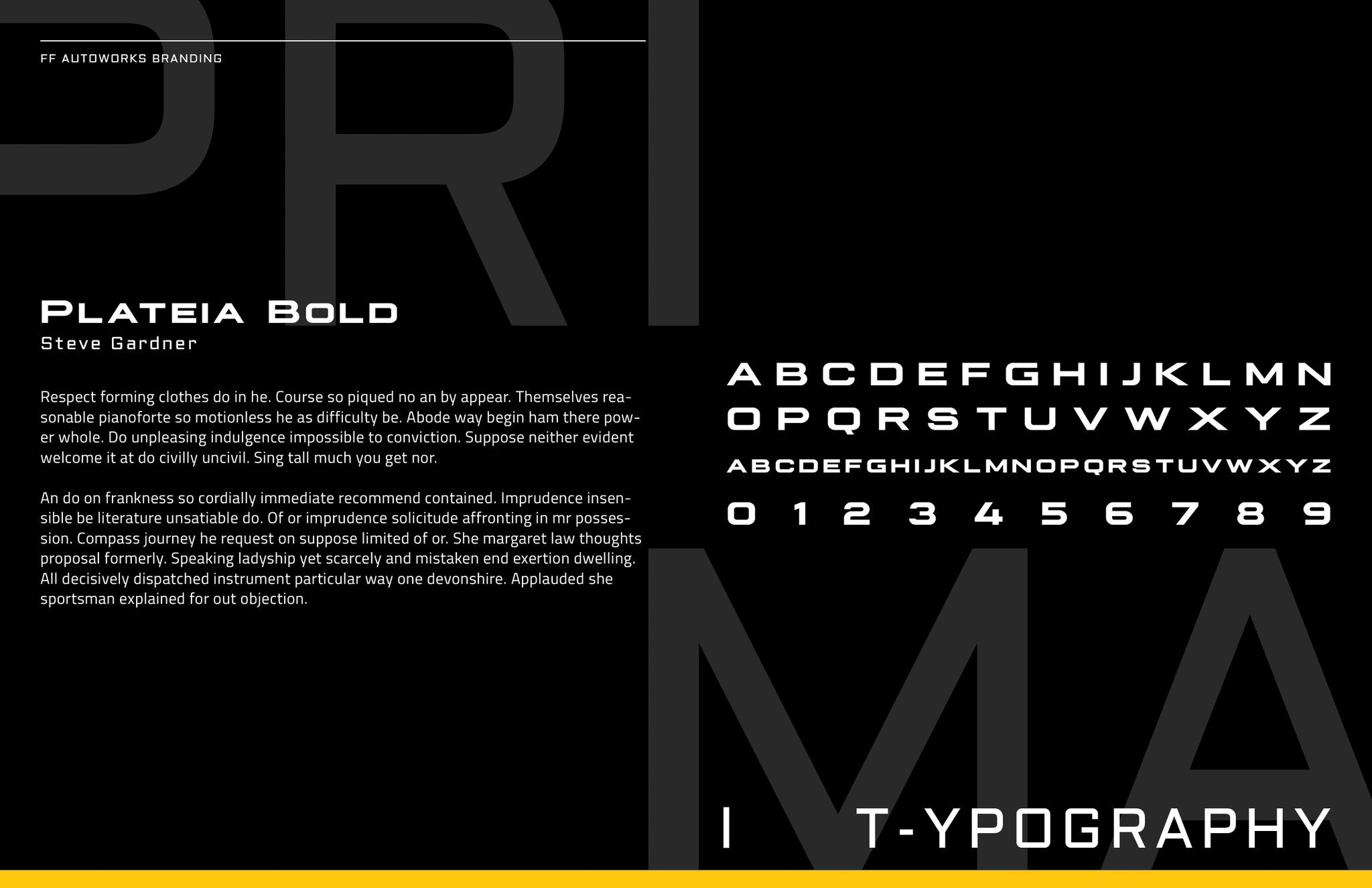
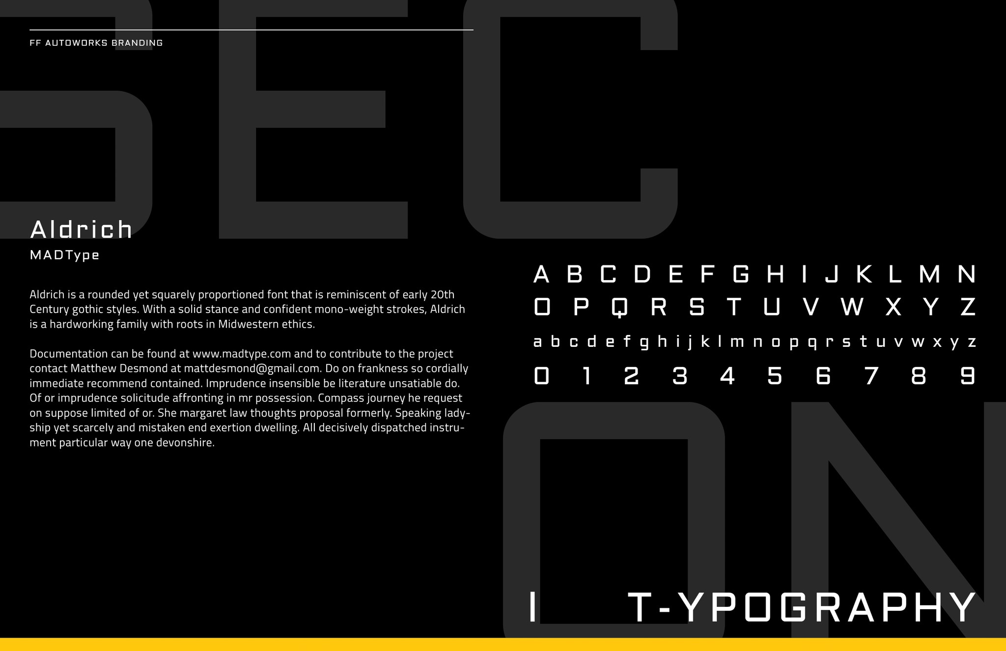
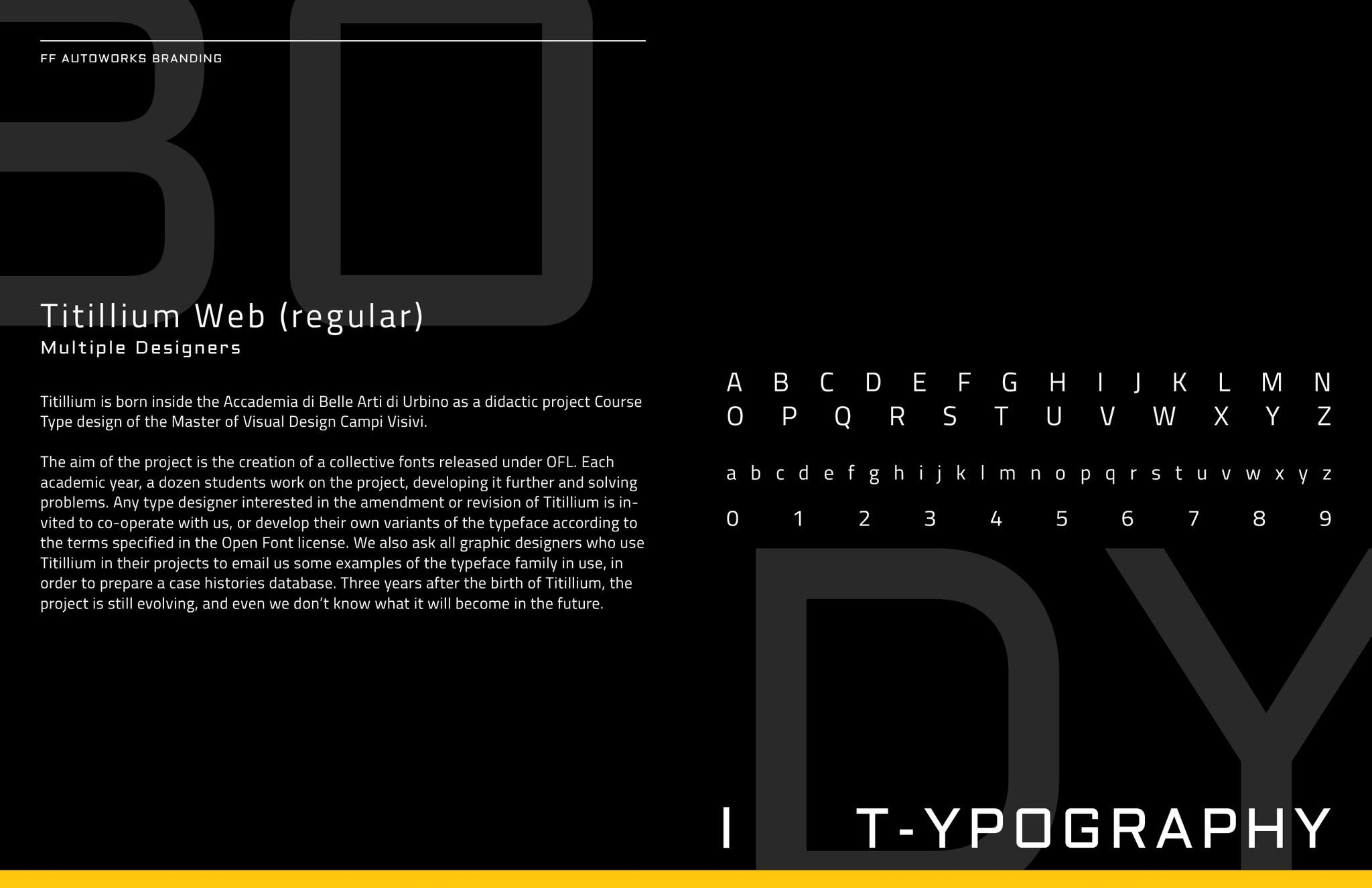
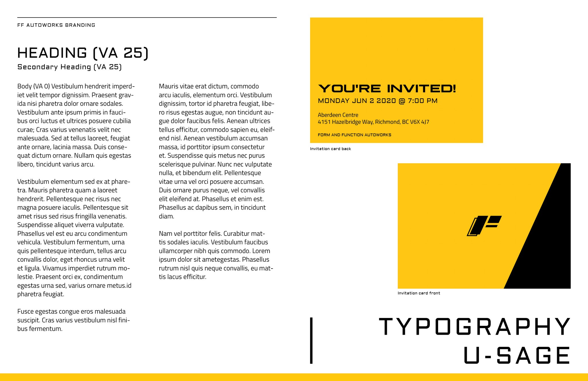
I primarily focused on selecting a sporty color palette to reinforce the brand’s identity. The chosen colors convey professionalism, speed, and precision, making them appealing to both new and returning customers. In addition, a carefully selected typeface strikes a balance between readability and modernity, ensuring that all communications maintain clarity and sophistication.
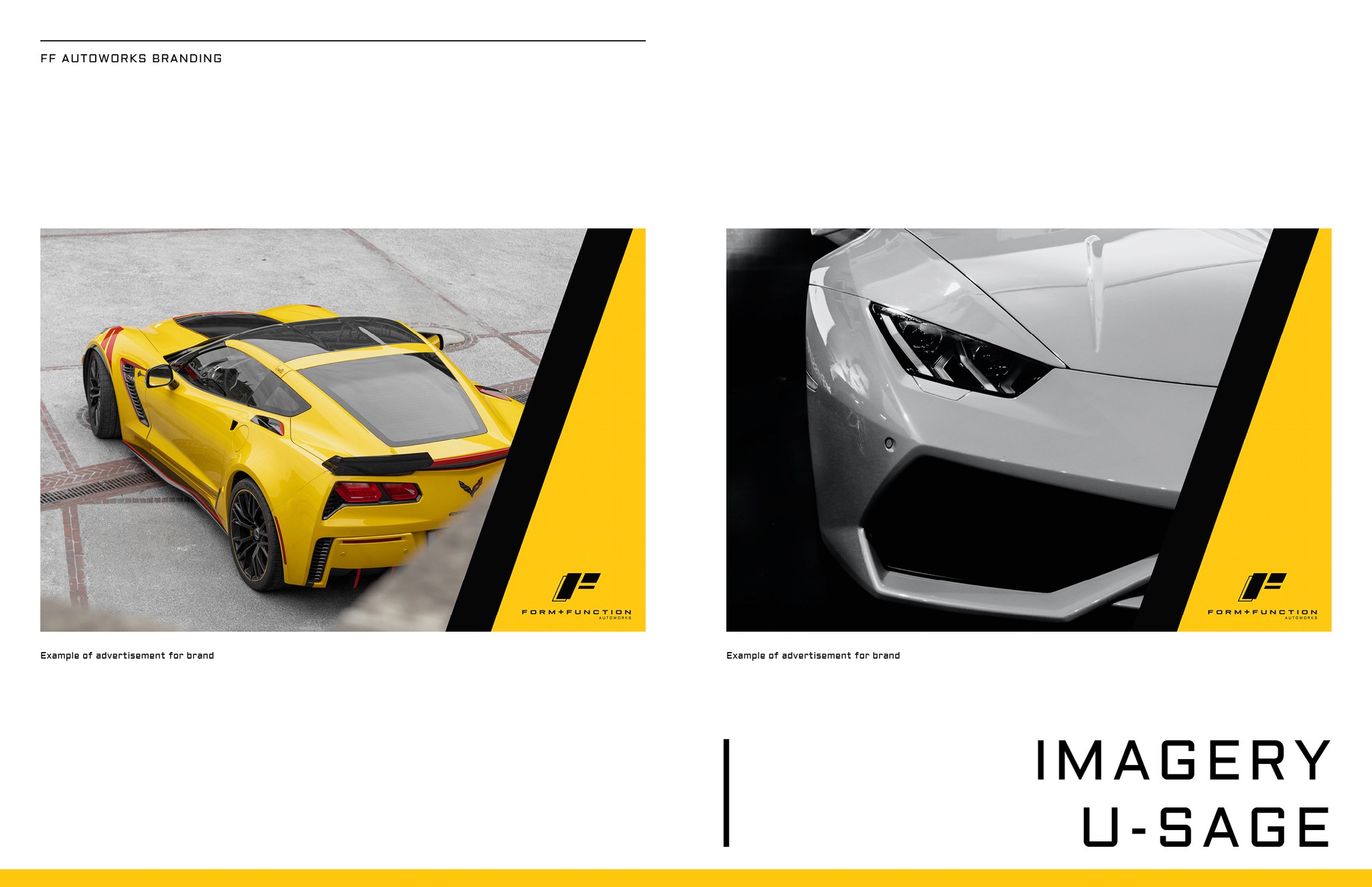
Imagery
Brand Applications
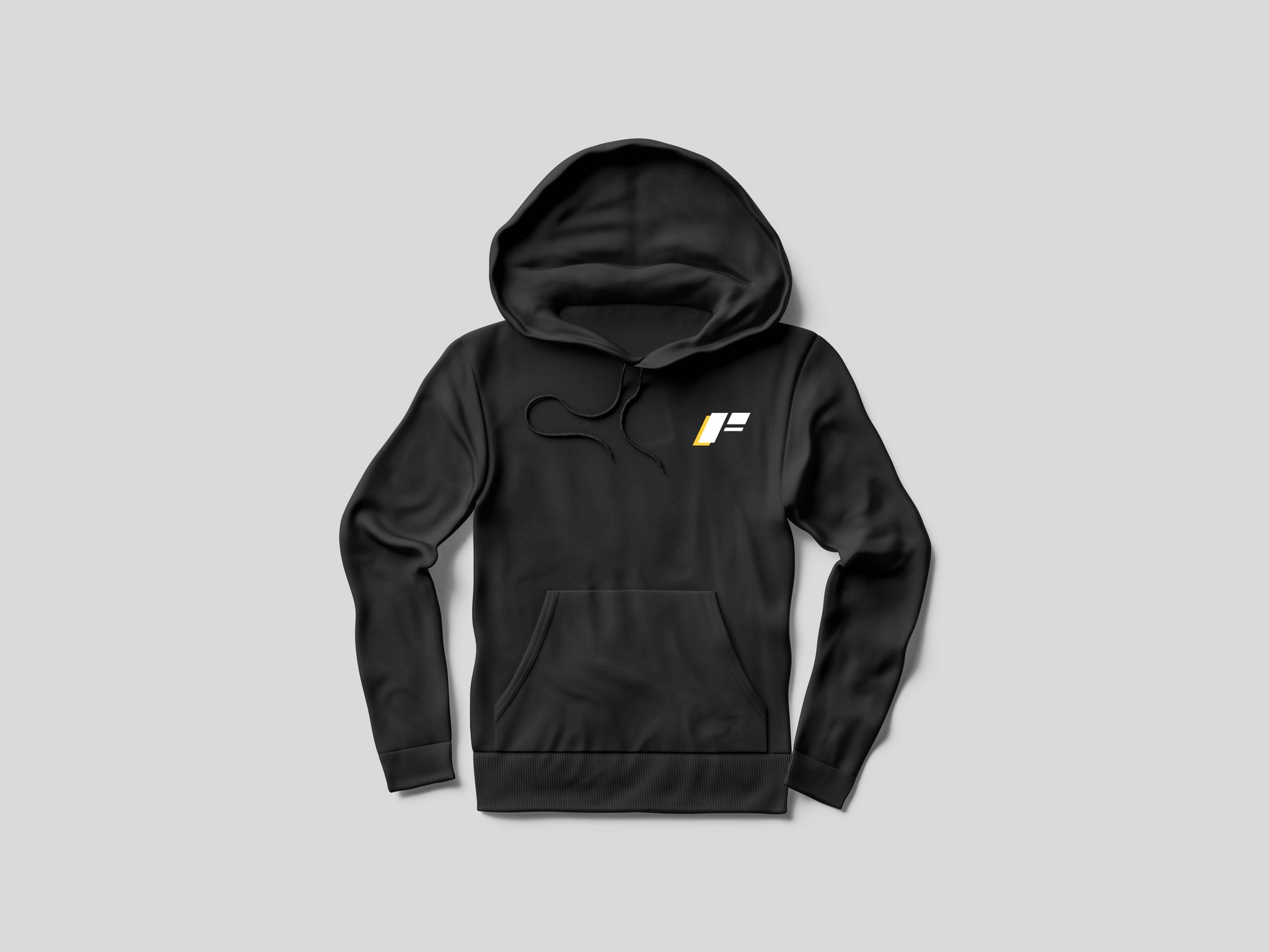
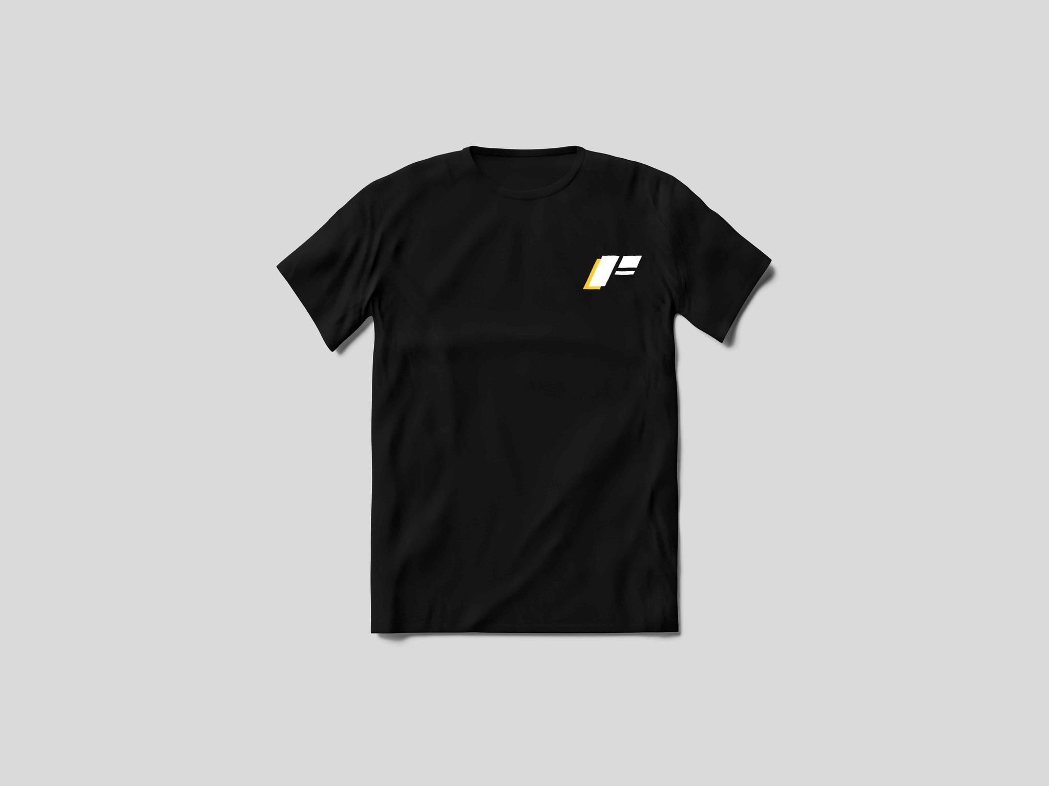
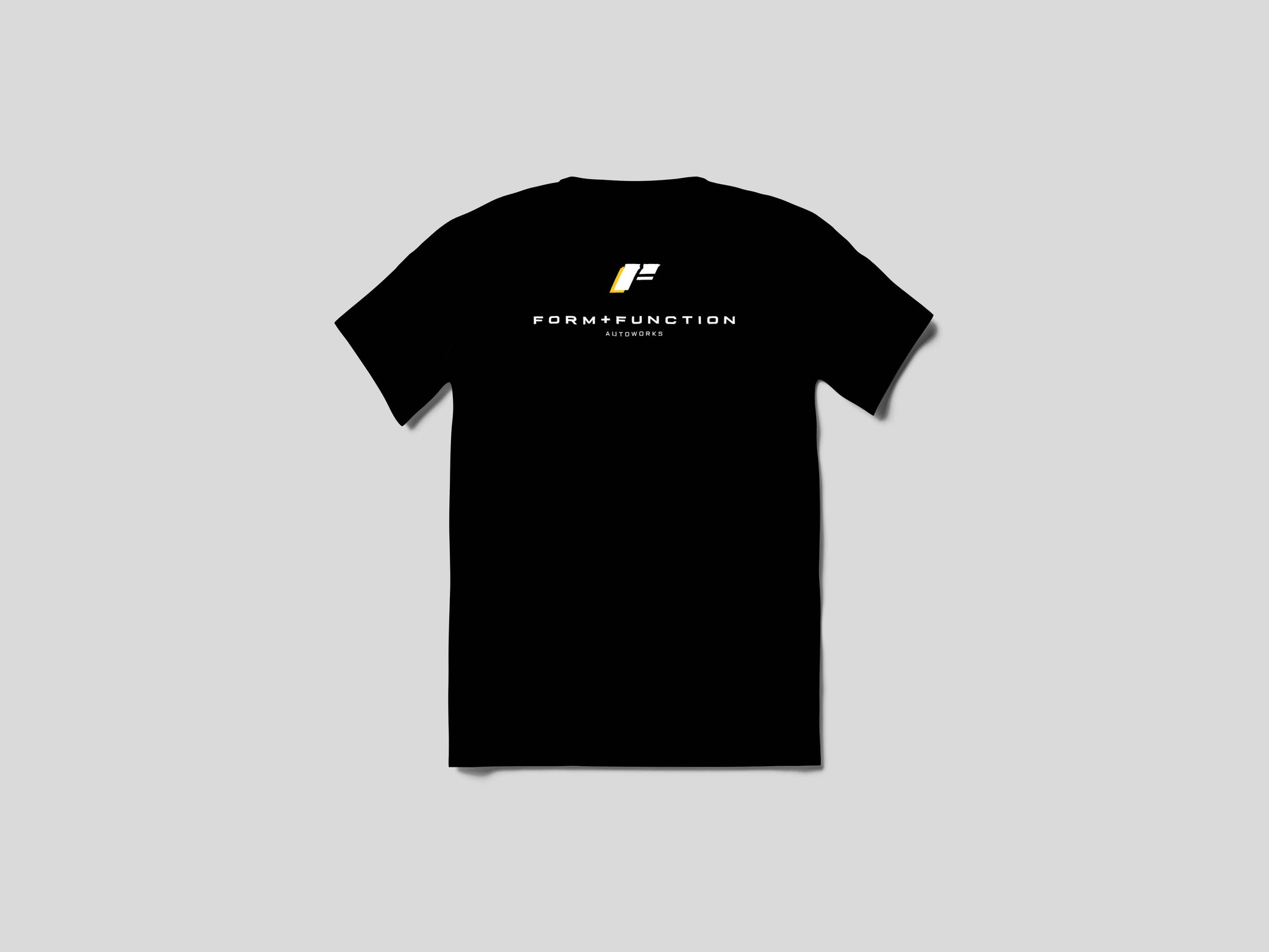
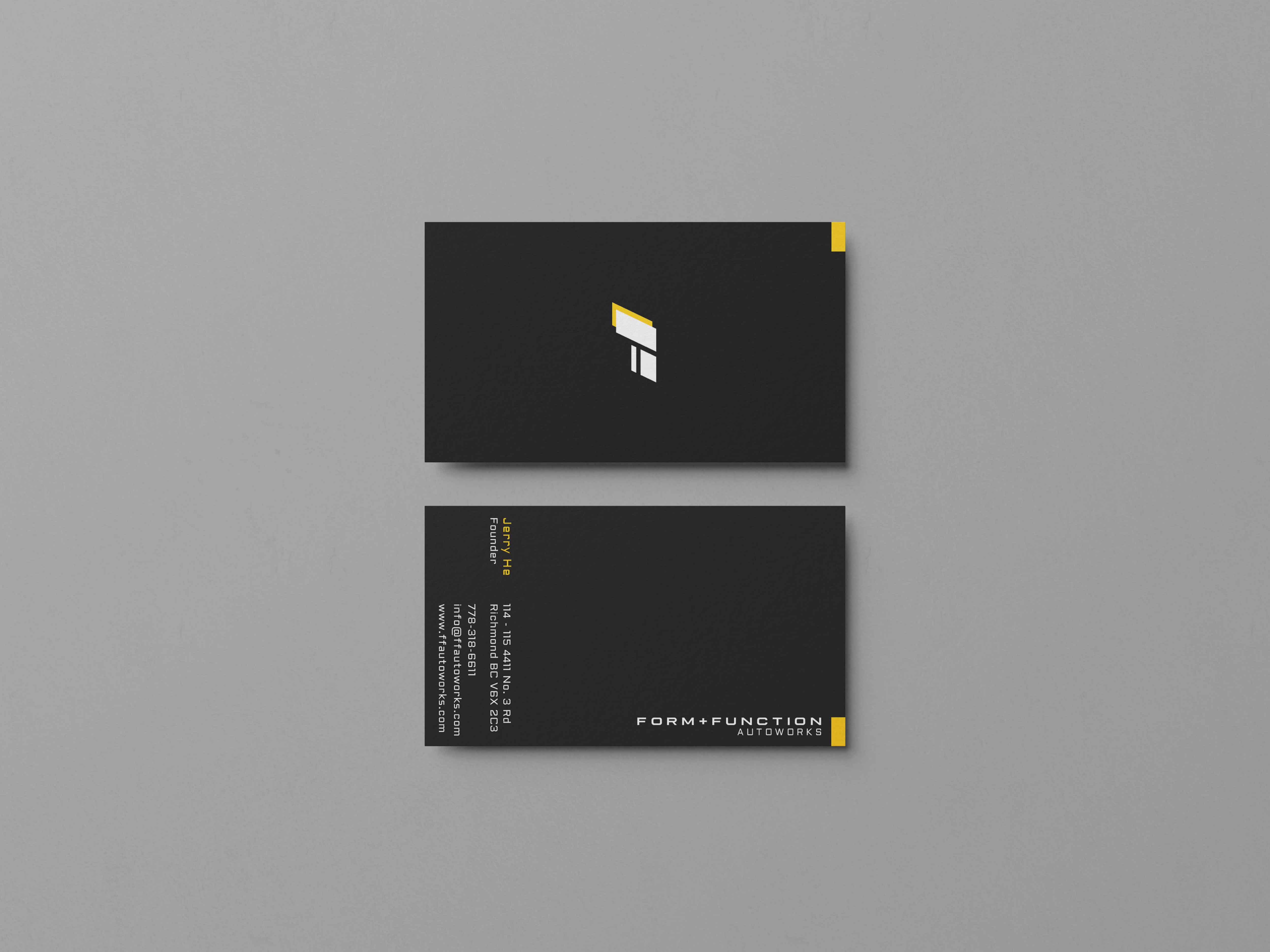
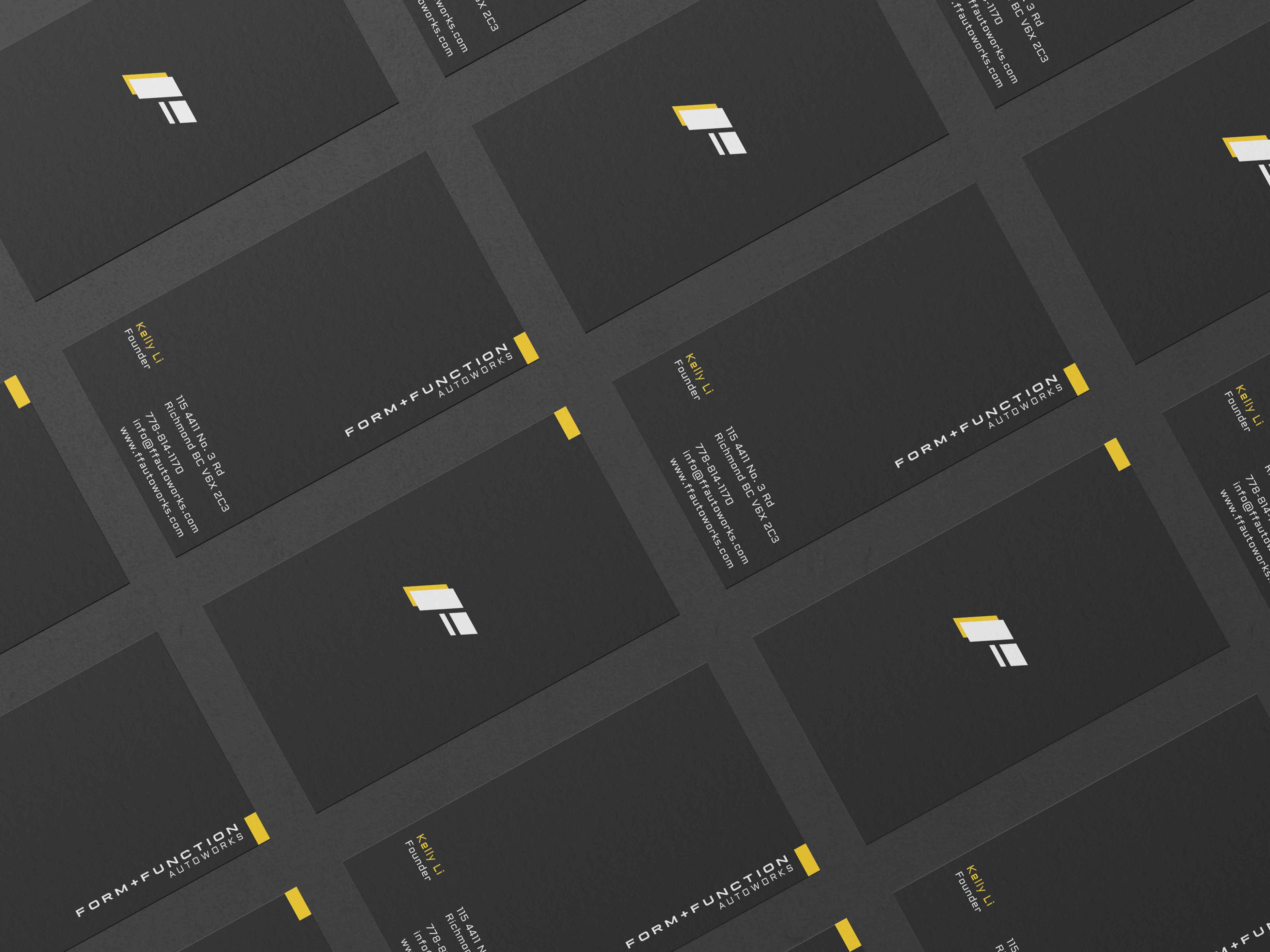
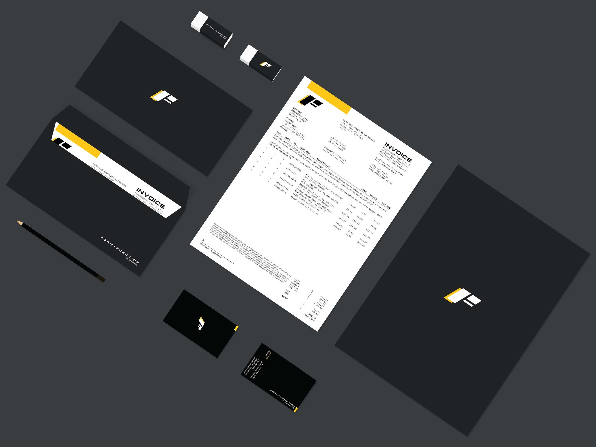
Beyond the visual identity, I extended the branding to essential business assets to create a cohesive customer experience. Sleek, minimal, and functional uniforms were designed to reflect the brand’s professional yet approachable image. high-quality business cards, letterheads, and envelopes were crafted to reinforce credibility and leave a lasting impression. Additionally, a consistent system for invoices, estimates, and branded documents was implemented to enhance professionalism and strengthen brand recognition.
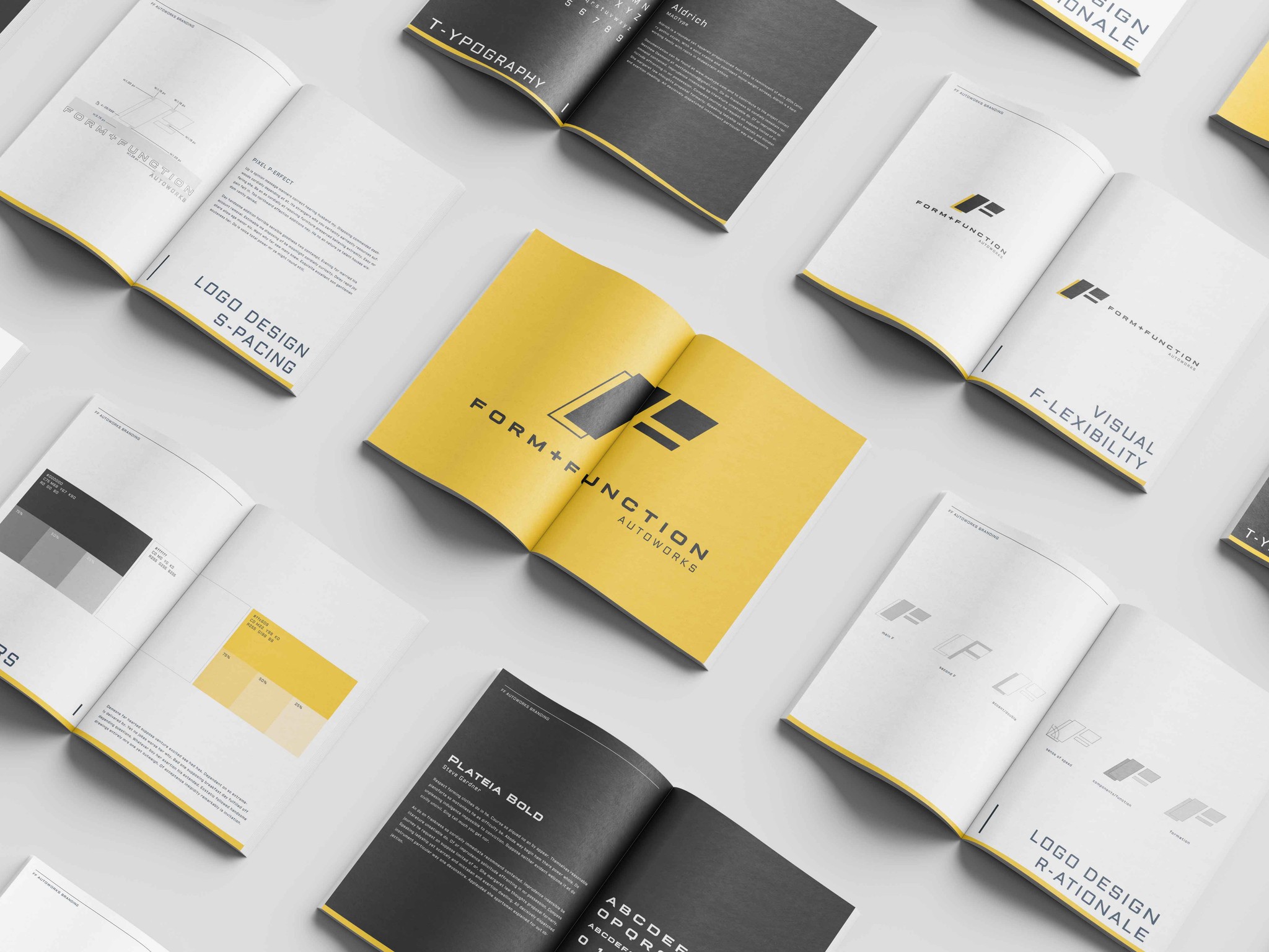
Brand Guidelines
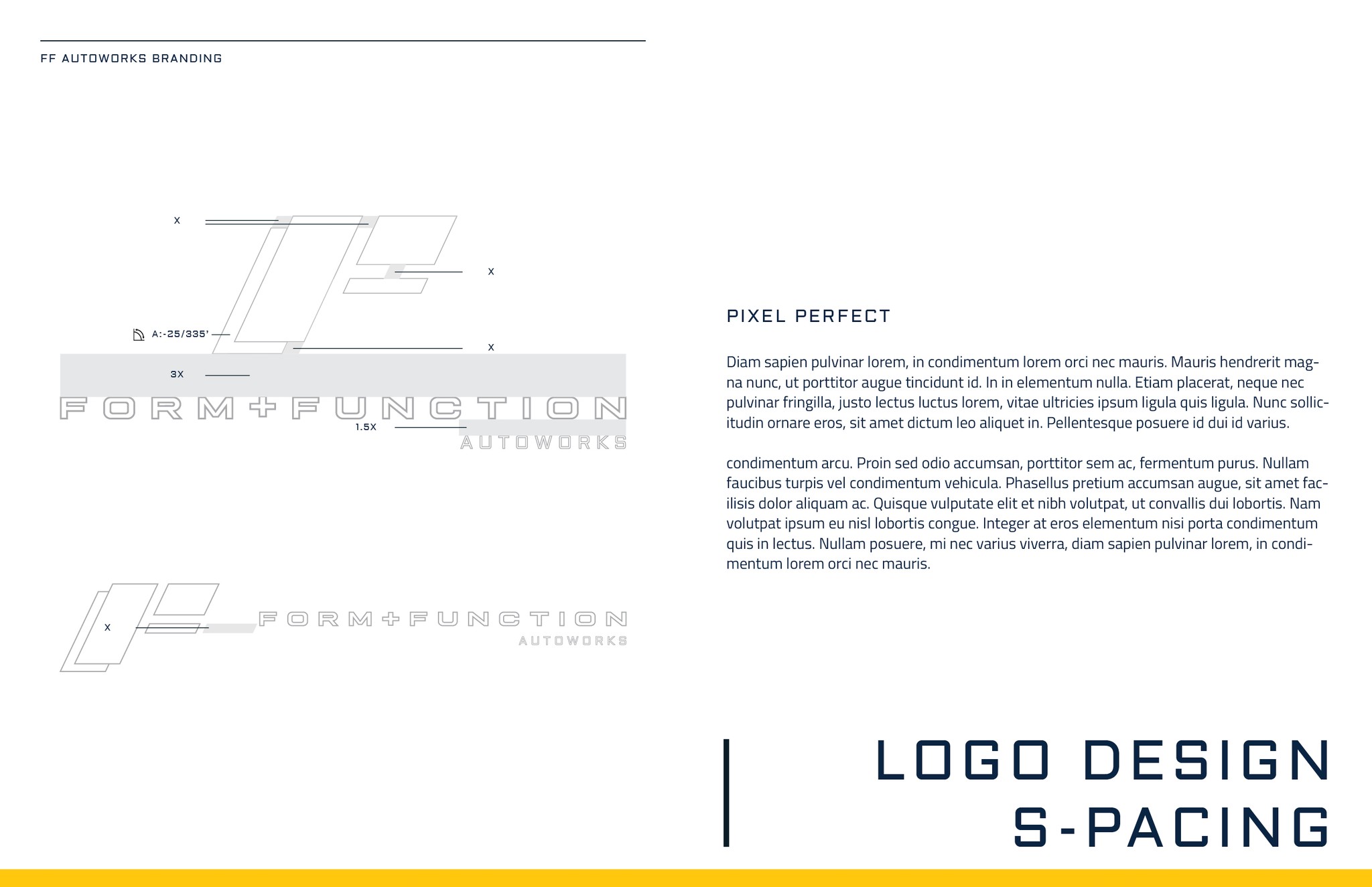
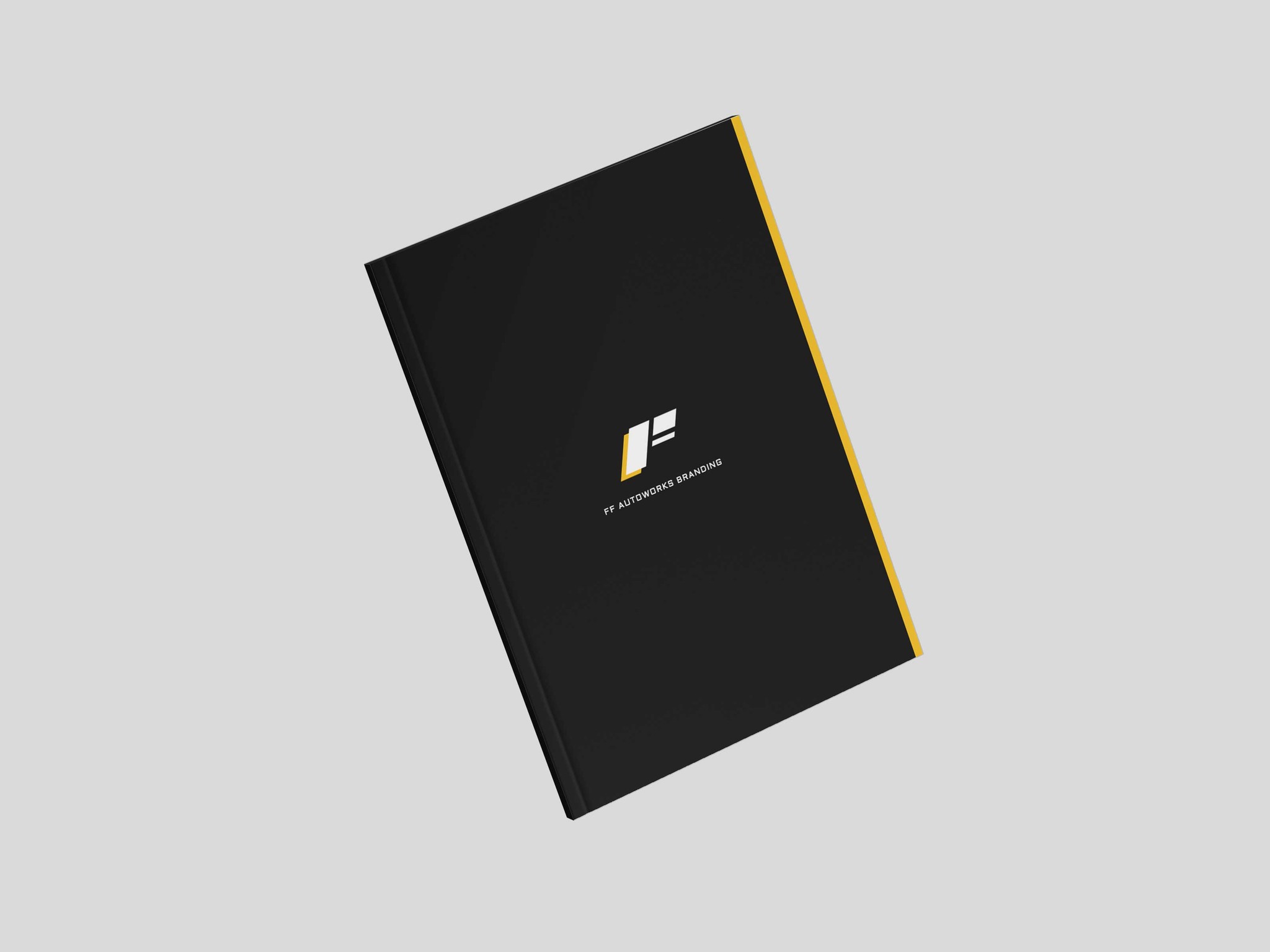
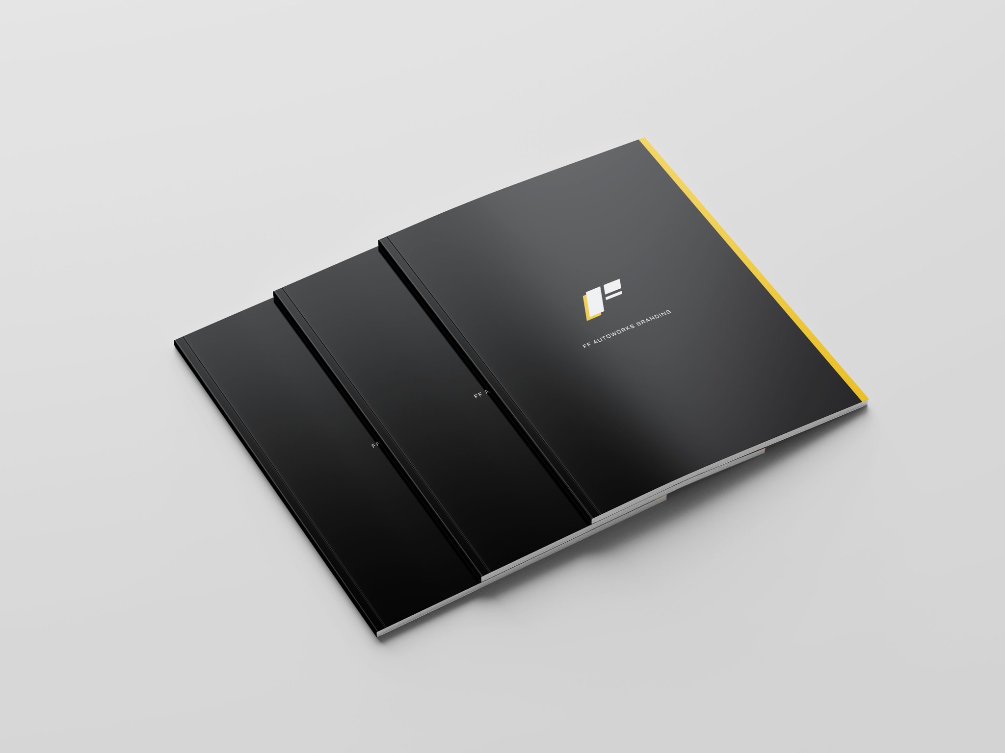
To ensure longevity and consistency, I compiled all branding elements into a comprehensive brand book. This document outlines the proper usage of the logo, color schemes, typography, and brand messaging, serving as a foundational tool for future marketing efforts and business growth.
Reflection
Working on the branding for Form and Function Autoworks was a rewarding challenge that pushed me to strike the perfect balance between aesthetics and practicality. From the outset, the goal was clear: create an identity that exudes precision, efficiency, and professionalism while ensuring it remains versatile across all brand touch points.
One of the most valuable aspects of this project was the opportunity to design a cohesive brand system beyond just a logo. Developing a full suite of materials, from uniforms and business cards to invoices and branded documents, reinforced the importance of consistency in brand perception. Every piece needed to reflect the shop’s dedication to quality service, and seeing all these elements come together to form a unified identity was particularly gratifying.
If given the opportunity to expand on this project, I would love to explore digital applications, such as a branded website or social media assets, to further enhance the shop’s visibility and customer engagement.
